But this leaves us with a very interesting question that could be the topic for some hot debate. If and when the Avs get another alternate jersey, what should it look like? Should it be the regular logo? COLORADO running down the jersey a la Rangers? The yeti foot logo? The possibilities are endless.
Here are a variety of jersey concepts for your consideration thought up and created by brilliant internet minds. Not us. Please note that most of these jerseys were borrowed from the website Icethetics, and we do not take credit for them. We are just putting them all in one convenient spot. Stick tap to all the creators listed in the pictures, well done!
First up, we have a nightmarish jersey that, judging by the trend of the NHL Stadium Series, could be seen as a viable option for the team come next season. The colour scheme remains the same, but overall, this would be just very unfortunate. Grade; F.
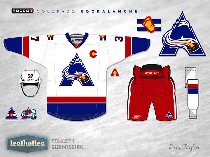
Next up, we have a new age design by creator Ross Taylor. The logo sort of blends the old Rockies logo with the Avs swooping A, and adopts the colours from the old Scouts/Rockies franchise. As an Avs alternate jersey, this one is not too bad! Grade: B.
The first of many COLORADO designs, this jersey seems to blend the old alternate from 02-07 and the current one, going with a bit of a darker blue. The striping at the bottom and shoulder yokes makes this jersey look pretty sharp, and the classic Avs font style remains unchanged. Grade; A-.
This jersey adopts the old template of the Kansas City Scouts, which conveniently uses Colorado colours. Ross Taylor again uses his blended logo, and it is interesting to see red pants on both the jerseys. Rockalanche has a nice ring to it as well.... Grade: B.
Keep in mind, we are just considering these jerseys as possible alternates, not replacements for the current home and aways. Ross Taylor is at it yet again, using old school striping with new school Avs colours, and the same logo as before. As an alternate jersey, any of these two would be nice, refreshing, and pretty darn sharp. A-.
Andrew Bourne has blessed us with this concept that can only remind us of the football styled Thrashers 3rds. Thankfully there are no numbers under the words. This is a simple jersey with interesting colours, and the shoulder yokes and bottom design are neat, but the logo isn't doing it for us. D-.
Now we're rolling! Justin Cox has created a wild and crazy jersey design, using the new Edge template, and how can you not like the creativity? On the ice, the players may look a little silly with the jagged striping, but the Captain's C and arm striping had us at hello! Come on, it wouldn't be as bad and boring as the Blue Jackets' 3rds. B-.
It took us this long to get to a Nordiques concept, but here we are! Chase and Jake Waddell have created a meld between the old school Avs jerseys and the Nordiques scheme. Complete with the Fleur de lis, this 3rd would be a blast from the past and contribute to the renewed hockey fever in Quebec City. C+.
We'll close off this segment with a few Stadium Series concepts by creator Cole Hamilton. As far as Stadium Series jerseys go, how can you not love this one? This jersey screams classic, with the off white center, simple COLORADO font, and big round numbers at the back. The square nameplate and bottom striping just top the whole thing off. Yes please. A+.
The next concept by Hamilton gets a little bit more fancy, with the mountain scenery. The colour scheme and striping concepts, as well the the arms look great, but that logo is a but out there, and would either weigh the jersey down or have to be screened on; none of which is a good thing. Maybe with a different logo, or just the wording, this jersey could be a real winner, but it still looks great. B+.
This is it for round one. What was your favourite jersey? Least favourite?
Let's all just hope the NHL and "creative minds" behind some of the alternate jerseys don't mess this one up.
Ok so due to popularity of the concepts, page 2 can be found here:


No comments:
Post a Comment
Now that you are part of the fast growing Avaholics Unanimous Family, we would love to hear from our readers. We will do our best to answer back. Thanks for reading! For blog updates, follow us on twitter at @Avaholics_U.