Here are some more Avs jersey concepts: Part 1 can be found here:
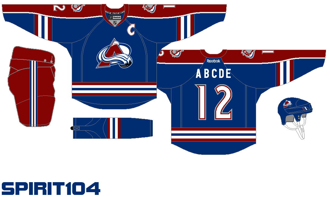
Another entry from Justin Cox, this concept mixes the 3rd jersey striping with the regular Avs logo. Another sharp new look that the Avs could sport, and probably a little nicer than the current blueberries. B+.
The bottom striping looks a lot like the new ducks jerseys, as does the sleeves, but in Avs colours, it looks pretty sharp. Sort of a plain looking jersey, but it still has more going on than our current ones. Also, nice job on the Nordiques themed 3rd, with the yeti foot at the bottom instead of the Fleur de lis. B-.
This jersey, designed before the departure of Paul Stastny, mixes the old Rockies logo with the current Captain's C and snowed peak. The striping is something out of the New York Islanders fisherman jerseys, and the arm stripes are bizarre. Neat concept though. B.
And we have our first yeti foot! Many fans have been pushing for the shoulder patch logo to dawn the front of the jerseys for years now, and who knows; this might be the chance they are looking for. The white and red trim add a nice touch, and the swooping pattern is a refreshing change from all the straight lined jerseys you see these days. As an alternate, this isn't too bad. B+.
Steven Grant offers this simple alternate jersey. Colorado blue with the primary logo, coupled with red, white, and black stripes adds to the appeal of this jersey, and come on Avs fans, no piping! C+.
Ever wonder what the old Avs jerseys would have looked like in the new RBK Edge design? Well wonder no more. As an alternate, these jerseys might be a little to familiar, but as a Stadium Series modern throwback? You never know. B.
We have seen the 3rds before, so lets just focus on the end one. Black primary colour with Avalanche blue and burgundy trim. Blue shoulder yokes add a nice touch, but overall, same stuff, different colour. C.
Does anyone else just love the white ones? Justin Cox at it again, reuniting the old 3rd concept with the primary logo. The striping is attractive and the colors just work together. A-.
Well what can you say about this design? The Colorado state C complete with a mountain top hat, and horizontal striping. These jerseys are just hideous, but in that kind of way that you can't help but sort of like them. with 5 colours throughout the jerseys, we'd be giving Buffalo a run for their money for biggest eyesore. C- and kind of B+.
To finish it off, we have the Avs primary logo with a redesigned 3rd jersey-esque template, and the result: Classy, sharp, and refreshing. The red pants are a little much, but everything goes so well together. It is just very hard to imagine the Avs with a different logo. A.


No comments:
Post a Comment
Now that you are part of the fast growing Avaholics Unanimous Family, we would love to hear from our readers. We will do our best to answer back. Thanks for reading! For blog updates, follow us on twitter at @Avaholics_U.